Top Paint Colors for Stylish Interior Inspiration
|
|
Time to read 9 min
|
|
Time to read 9 min
Content updated July 2024
Another year is almost here, and that means fresh design inspiration! We love a chance to embrace fresh trends and we're all about color! Beige interiors take a huge step forward with the introduction of Redend Point, while emerald green remains at the top of trend lists. Check out some of the top trending paint colors to pair with new tiles for a new year!
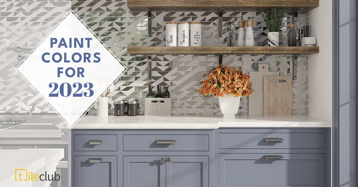
Pairing the right cabinet paint color and tile backsplash is like creating a recipe with the perfect blend of ingredients! We love this blue gray paint color with our white and silver Deco Brick glass tiles!
When it comes to home décor, one of the most important considerations is your color scheme, whether that’s your tile color or paint. The right color scheme can enhance the look and feel of your home, making it a more inviting and comfortable place to live. But with so many options to choose from, how do you know which colors are right for your home?
Here are a few tips to help you get started:
First, take a look at the existing hues in your home. Notice the trends within the space itself. Do you tend to use more warm tones or cool tones? From here, you can find a paint color that works well within your current decor scheme.
Crisp white and blue are a natural choice for a calm and relaxing space at home! This white marble bathroom floor pairs perfectly with soothing blue paint.
Second, consider the style of your home. If you have a traditional home, then classic colors like white and beige are always a good choice. For a more contemporary look, try using bolder colors like a rosy red or blueish green.
Finally, don’t be afraid to experiment. There are no hard and fast rules when it comes to choosing colors for your home. So if you’re not sure what will work, try out a few different options and see what you like best. With a little trial and error, you’re sure to find the perfect color scheme for your home.
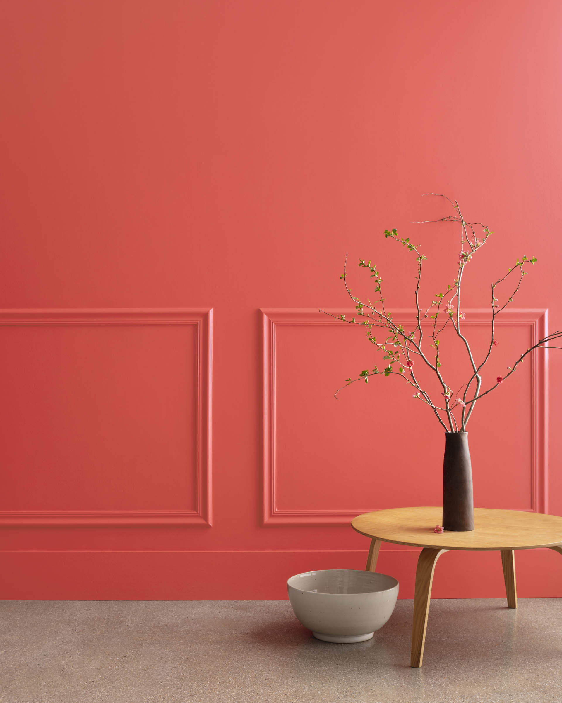
Raspberry Blush by Benjamin Moore
Benjamin Moore’s Color is Raspberry Blush! It evokes the feeling of fresh berries in the early summer, dew grazing their surface, tart but refreshing, and full of immediate delight. This coral-esque color is perfect for anyone who wants to add a touch of femininity to their home without going overboard. It’s delicate and pretty, but it also has a bit of an edge.
Raspberry Blush can create a comfort-first interior (a cozy living interior trend). The reason? Simple. It’s both cheery and warm. This combination makes the paint color perfect for use in reading nooks, mudrooms, and living rooms.
And while it’s definitely a statement color, it’s still versatile enough to work with a variety of design styles. To incorporate vibrant hues into your home, try pairing it with neutrals like white or gray. You could also add in some metallic accents for a touch of glamor. Whether you use it on walls, floors, or furniture, this bold palette is sure to make your space look and feel unique.
Redend Point by Sherwin Williams
A true neutral tone color, Redend Point works well with modern, Western style homes or transitional homes. Whether you're looking for a color to complement your existing decor, or you're looking for a stand-alone statement piece, Redend Point is the perfect choice.
Redend Point from Sherwin Williams is a prime example of a middle-of-the-road neutral. It's flexible enough to work with cooler tones, yet it can also play well with more statement colors.
Since this color is a muted, Rorschach-esque burgundy, it would be stunning in a formal dining room or library. If you want to use this color in your home, try pairing it with deep green accents. It would also look amazing with brass fixtures.
Don’t just take our word for it, Sue Wadden, Sherwin Williams Director of Color Marketing, explained it to ArchDigest as “a great option [that] plays well with other neutrals, if you put it next to beige, Redend Point really looks like a color. But on its own, you see that it really does act like a neutral, so it’s well-behaved.”
Check out how the muted neutral tone stands out in this dreamy, bohemian eclectic bedroom. The reds, and pinks bring out the undertones of the color of Redend Point, beautifully. We love the way the design is both warm and cool at the same time. That’s the beauty of this earthy paint color.
Digital Lavender by Pantone
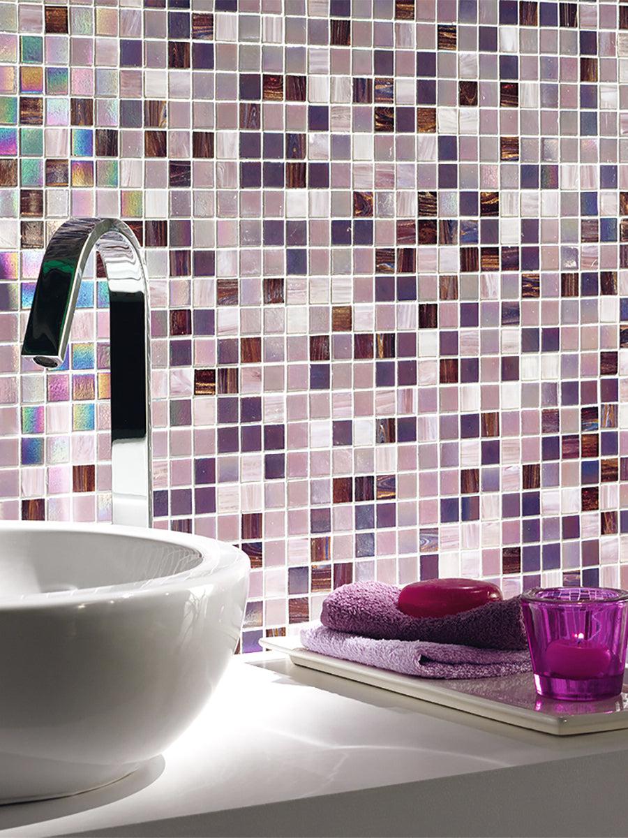
Mosaic tiles can really bring this color to new heights. Take the way our Peony Lavender Mixed Squares Glass Tile has a shimmering, pixelated effect. It’s modern, sleek, multifaceted, and 100% on point with the concept of Digital Lavender.
Lavender. Is there a more serene, calming, or spa-like flower? Not really. The natural color of the floral itself is soothing. So, it’s with little wonder why design experts figured this would be Pantone’s 2023 Color of the Year. Unlike their actual choice, Viva Magenta, Digital Lavender speaks to wellness and serenity.
With more people trying to find their footing as life becomes more normal and adjusted, spaces look to pretty colors to help them realign. For instance, Digital Lavender can make for a perfect spa-like bathroom interior color that allows homeowners to retreat and rejuvenate after a long day. On the other hand, offices can incorporate it into waiting areas or meditation rooms for their employees.
Lisa Peck, CEO and principal of LiLu Interiors told Midwest Home: “Digital Lavender would be fabulous to use in either an office where you want to be both creative, calm, and productive or in a bedroom as a wall color.
Hello, shimmery, soothing lavender! Not only is lavender a popular paint color but it's also a great way to add a touch of luxury to your home. Thanks to its calming hue, lavender is perfect for creating a serene space that feels both fashionable and timeless. Look at the way this bathroom uses our Lavender subway tiles to flow with the light lavender paint. They work together magnificently! Proof you can have both durability and trendiness in one shot.
Terra Rosa by Dunn-Edwards
Terra Rosa embodies everything we need right now: the comfort of pink, the drama of deep hues, and the strength and protection of a powerful color.
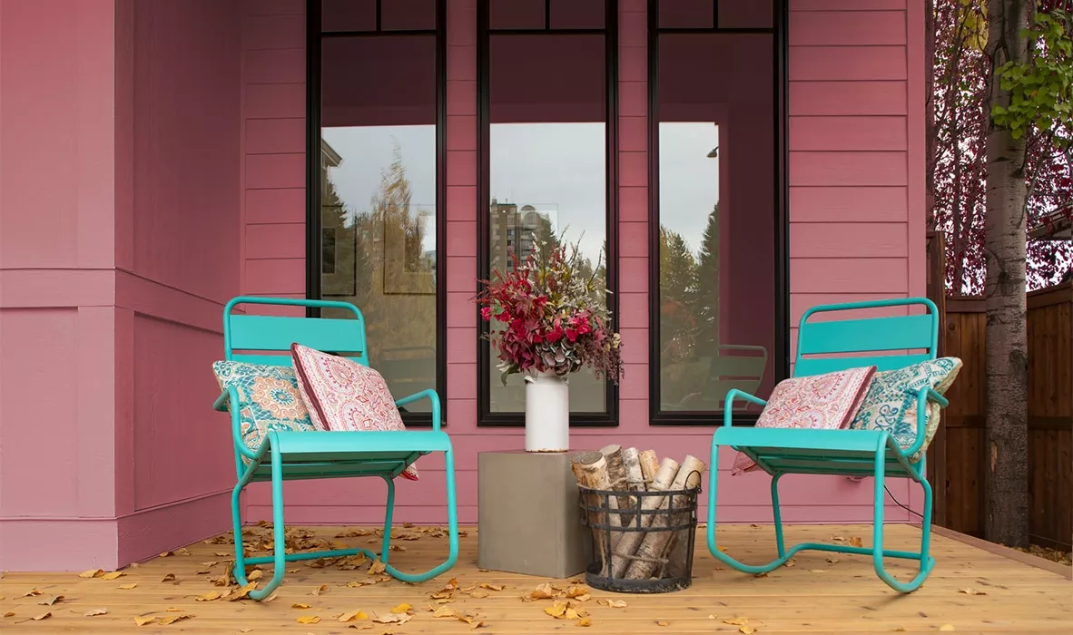
Terra Rosa is a warm, romantic hue that evokes feelings of comfort and stability. Its red undertones make it perfect for creating a cozy atmosphere, indoors or outdoors. Its pinkish hues add a touch of femininity in a playful way. Whether you want to paint your living room walls or add a pop of color to your porch (like above), this versatile hue is sure to make a statement.
As one of the most popular colors for nature lovers, Terra Rosa, is a beautiful pink hue that's inspired by nature. It's perfect for anyone who wants to find joy in everyday moments. The best part about Terra Rosa is that it can be used in a variety of ways.
This beautiful rosy pink shade is perfect for accenting a wall in your living room or bedroom, or for painting an entire room. No matter how you use it, this paint color is sure to add a touch of beauty to your home.
If you’re seeking a more feminine option, this one by Dunne-Edwards is sure to be a match. It is a romantic choice that is sure to make your home stand out from the rest.
Can we take a minute to appreciate the way Terra Rosa works in this timeless home's hallway? The contrast of the white molding against the pink hues is just perfect. The paint color – inspired by a type of red clay soil – is bold, natural, and earthy in a ladylike way. Plus, the color pink is known to be very calming and relaxing. This home is the perfect example of how two seemingly contrasting colors can come together to create something beautiful, transitional, and serene.
Blank Canvas by Behr
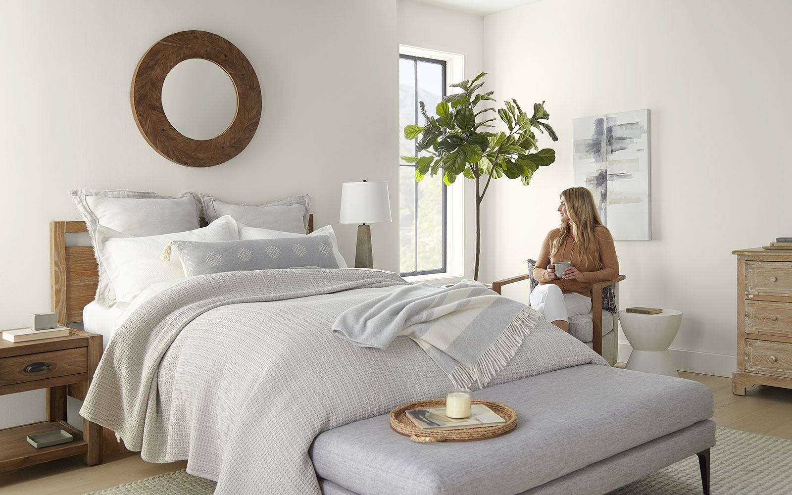
Not one for neutrals? You may want to parlay your way into them this year with Blank Canvas by Behr. The beauty of this off-white, warm hue is the perfect shade to make an interior backdrop that’s easy to build off of.
But don’t let us do the talking: Erika Woelfel, Behr’s vice president of color and creative services, described the hue as “that perfect artistic color for people to start expressing their creativity.”
See how stunning the Blank Canvas paint looks in this organic modern bedroom design. It brings a lightness to the room that allows natural light to shine through easily. A great starting point for those wanting to use white paint, but prefer more dimension.
Now, doesn’t that sound like a color worth using? We sure think so!
After all, not all white paints are created equal, and finding the right one can sometimes take work. Some can feel cold and sterile, while others can be too sheer, making it difficult to achieve the desired look.
Blank Canvas paint is the perfect solution for those looking for a white paint that is both chic and easy to use. The light hue creates an airy feeling in any space, while the slightly off-white tones add just enough dimension to give the room some depth.
Whether you're wanting to create a clean and modern aesthetic or simply brighten up a room, Blank Canvas is a great place to start.
Vining Ivy by Glidden
Vining Ivy is a unique shade that is a mix of blue and green. It's perfect for adding a touch of personality to any space, like shown here in this bedroom. It pairs perfectly with the colorful bedspread, eclectic decor, and plant life. The color is proof it can be a chameleon, blending in or standing out depending on the surrounding decor.
Is it blue? Is it green? Is it blue-green? The ongoing debate on the true color of Vining Ivy by Gildden is even a hot topic within the company itself. This gorgeous color is described on their website as a “‘bluish-greenish-something-in-betweenish’ color”.
While the color itself may be up for discussion; the exquisite versatility of it is not. It can easily find its home on the kitchen backsplash as it can in a powder room. You can dress it up for a midcentury interior design look, pairing with classic brass accents, and angular furniture. You can also create a transitional home with it, thanks to the hue, and pair it with a leather couch and marble coffee table.
This transitional modern home showcases Vining Ivy with a bluer tone, thanks to the reflection of the wall art. It creates a cooling atmosphere perfect to kick back and relax. We love how the room added warm, red pillows to create a contrast. It elevates and attenuates the paint color.
Wrapping Up Paint Colors Trends
These paint colors are sure to make a statement in any home. By being ahead of the trend and incorporating these colors into your design now, you’ll be ahead of the pack.
Have fun experimenting and don’t be afraid to step outside of your comfort zone for the next year! If you’re looking for a way to add some personality to your space, try painting an accent wall or using these colors in your accessories. Or, if you want to go all out, use them as the main color palette for your room.
Regardless of how you use paint colors in your space, these various hues are sure to make a definitive impact. So, get creative and have fun!
Lindsay Fluckiger is a shining example of what happens when passion meets expertise in the digital marketing world. With a robust background in social media marketing, contract negotiation, social media advertising, and influencer marketing, she has become an integral part of every team she's worked with.
Her journey in the digital space took a significant leap forward at HGTV, where she served as the digital marketing manager for designer and TV personality Breegan Jane. Here, Lindsay's skills in content creation, social media and brand strategies were pivotal in driving digital transformations and boosting brand visibility.
Previously, Lindsay sharpened her skills at INK Public Relations, a boutique firm representing heavy hitters in the design space based in Los Angeles. Managing the social media presence for high-profile clients such as TRIO Design (Angela Harris) and Brandon Architects, she distinguished herself with her expertise in contract negotiation and social media advertising.


